Monday, October 7, 2013

QR ME!

For one of my projects, I had to take advices from artists around me and make an art piece out of it.  One of advices that kept coming up from several people was, Make connections, surround yourself with interesting people! “Use social media to network and connect to individual artists, galleries, art centers, non-profits, organizations etc. and be as aggressive as possible with exhibiting your work.”

I took the advice literally for my project and decided to make a blog, a tumblr page, and a Linked In  account.  I have always been very lazy about communicating and getting my work out to the public. I took this project as my opportunity to start getting myself "out there."  

So the procedures for my project was first, I got started on blog, Tumblr and Linked In account (Something I have never really tried before).  After, I went on to free QR Code maker website and got three QR codes for each of my social networking pages.  I used Photoshop to modify my code with different colors and printed them out to transfer them on to acrylic sheets.  I used gel medium for the image transfer and I let them sit for about 7 hours minimum to let them dry before I removed the print from the acrylic sheet.  Because I wanted my codes to actually work, I had to repeat these steps 2-3 times per each tiles to make clean, accurate image.   


trial version on the acetate

removing the image by wetting sponge

putting them on a bigger acrylic sheet with acrylic cement


<Final Project>


Thursday, October 3, 2013

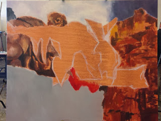
Oil Painting of A Collage (In Progress)

Yes, I go to an art school, but I have NEVER done oil painting!  So, before I go further with my studies, I wanted to give it a try. So far, I'm absolutely in LOVE with oil painting.  We have worked on color studies and quick still life (only two classes worth) painting.  For our third painting, we made a collage to work from, and I guess this is my first oil painting!  I just started this painting yesterday, and I am very excited to see how it turns out.  


Tools, Materials and Processes III Stop Motion

My most recent work that I worked with one of my classmates.  The project was to make a stop motion that is less than 30 sec that depicted natural phenomenon without using any nature element (no food allowed).  My partner and I worked on showing water drops with tin foil, yarns, paper and yoga mat.

Enjoy!

better quality on vimeo:


Concept, Form and Context I

Concept, Form and Context I: Human being is one of mandatory courses at the Penny Stamps School of Art and Design.  CFC I is definitely a course that nurtured me to be more considerate in making decisions for my works.  We made three different works in total and here they are.


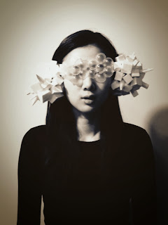
The medium given was recycles.  I used a plastic water bottle, styrofoam and my daily contact lenses' case.  The piece is a wearable piece that is supposed to let me "run away" from my reality.  There are times when I do not want to hear or face what's in front of me.  This work will distort my views and block sounds of my surroundings.  


For the second project, we were assigned a partner to interview, and were told to make works about each other.  I was inspired by Joseph Cornell's boxes and made a small box that portrays my partner's characteristics. 


For our last project, we chose an art works, and wrote a description about them.  Later, we exchanged the descriptions (without name of the artist or art work) and were asked to make an art piece based on the description.  We were shown with the original work later; the work of mine was a very old wooden puppet.  I wish I have a photo of it and will try to add it to the post later.  

Wednesday, October 2, 2013

Tools, Materials and Processes I

Tools, Materials and Processes I a.k.a. TMP I was an intense introductory course to five different mediums: paper/felt, metals, plaster/clay, plastic and wood.  The class met every friday from 9 a.m. to 4 a.m.  We worked with each medium for three weeks.  The first week was an introduction to the materials, the second was an introduction to the project, and the third was a critique week.  Classes were fast paced, but I learned a lot from TMP I, and I should say it was one of my favorite classes in Penny Stamps School of Design.  

Wood, plastic and paper/felt were my favorite materials.


For our wood project, we had to make a body part.  I thought age rings are very interesting and wanted incorporate them with my work.  I thought it would be very cool to make something circular so the rings works naturally as patterns and decided to make red blood cells.  


 This was my final wood project,  I made a rib cage that is heart-shaped that can work as a dish to hold red blood cell.  The thing that is standing behind is tubes of heart.  


1. 2.


1. The Little Prince by Antoine De Saint-Exupery is definitely one of my favorite books.  We were told to make a lamp out of acrylic sheets.  I laser cut the letters and the famous drawing of a snake, which swallowed the elephant.  

2. The paper/felt work was done with my partner.  The project was to make a headpiece that is NOT a hat.  We made an orbital shape out of felt and paper.  We structured the big circle by over layering a lot of fabric and paper to make it stiff.  

The Scholastic Award 2011 & 2012

The dissected laptop was an observational drawing I did for my AP Art/ college portfolio. I won Silver Key in 2011.

This subway piece was one of chair series for my AP Art concentration.  I won Gold Key in 2012.

AP Art 2D Drawing Portfolio

Yes, I did take AP Art twice in my high school. I was in 2D drawing during my junior year and 2D design during my senior year. My concentration topic was chairs. Chair can be such an ordinary object. However, chairs can be seen in various forms and also have different connotations.


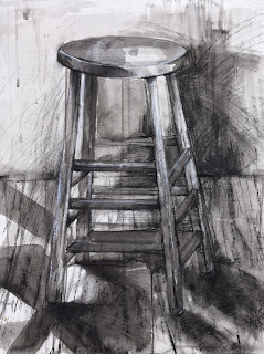
A Stool (mixed media)


Abandoned (mixed media)


Untitled (mixed media)


Pressure  (mixed media)

AP Art 2D Design Porfolio


As I was skimming through magazines in a cafe, a retro Coca-Cola advertisement with James Brown from 1970 caught my eyes.  I really liked vibrant colors and the movements shown through lines in the background and decided to make self-portrait similar to the advertisement.  I first worked with Photoshop to alter photo of myself and then colored the painting with poster color.  


My 2D design concentration topic was zodiacs, but I later changed it to illustration of desserts with characters that resemble desserts.  This is one of the works I did for my first concentration topic.  I derived this piece from Koreans' belief that the shape of a Korean map resembles an image of a tiger roaring just like how Italians think of shape of their map as a boot.  


One day, the deadline for a project was approaching and I was still struggling to find what I wanted to work with.   I just randomly spotted a kettle in the kitchen and decided to do a line drawings.  I later accentuated lines with thin strips of tape. 


I was just randomly playing around with my horseshoe stamp and I realized how I can create shades by adding layers of stamps. After, I decided to work with stamp instead simply using pencil to shade in the self-portrait.

2 Required Drawing Samples for RISD


This is a drawing I worked on in rising-senior summer for RISD's notorious bicycle drawing requirement.  Instead of drawing a moving or standing bicycle, I drew a folded one to express modern day problem of obesity.  I altered the bike with unhealthy foods such as pizza and vienna sausage.  I drew in a lot of patterns and little creatures to add more dynamic and messy quality to the piece, but looking back, I wish I went further with idea of obesity.  


Another drawing for RISD's drawing samples.  I believe the prompt was to include texts in your drawing.  However, I ended up not using the drawing, because RISD eventually eliminated the prompt later.